

Project duration — 1 week
PROJECT TEAM MEMBERS
UX TEAM
- Precious Amarachi Ibe — Team Lead
- Dorcas Onome
- Ekom Efaiwa Fidelis
- Christian Chibuikem
UI TEAM
- Hyacinth Onyekwuo - Team Lead
- Alice Awobite
- Charles Dara
- Samson Olasore
- Opeyemi Blessing Oyawale
- Adegoke Boluwatife
PROJECT OVERVIEW
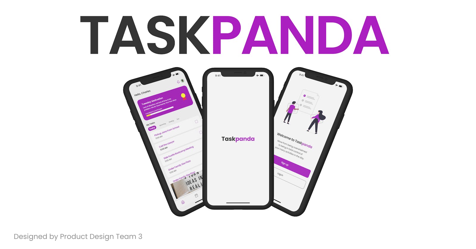
TaskPanda is a web-based application that allows users to create, prioritize, and schedule tasks in the order in which they must be completed by specific dates and times. TaskPanda is intended to help users effectively plan, handle, and manage their tasks on a daily basis.
PROBLEM STATEMENT
Users who are unable to complete their daily responsibilities experience a negative mood shift, making them feel overwhelmed and less productive. They also struggle to find enough time to complete all of their chores, and those who use written to-do lists are more likely to disregard them due to the lack of any type of reminder system.
GOAL OF THE PROJECT
The Task Panda app's purpose, as implied by its name, is to provide a responsive (web and mobile-based) solution aimed at relieving users of the difficulties they face when carrying out their numerous tasks on a daily basis.
The project's goal is to create a simple to-do app with tools to help users manage, edit, delete, and create tasks. It will have a voice prompt to remind users to complete their tasks successfully, as well as different language options for improved user comprehension.
DESIGN PROCESS
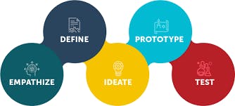
USER RESEARCH
Understanding the needs and desires of our users through empathy was a key component of our ux research methodology. The knowledge gained from this study was put to use to improve our product's design process. In order to understand their requirements and experiences and to gather quantitative and qualitative data, we conducted a survey with 13 potential users in conjunction with individual interviews.
OBSERVATIONS
Questions asked:
1)Would you prefer to use a to-do application that has a voice reminder?
2)Would you prefer to use a to-do application that includes an option of enabling multiple languages?
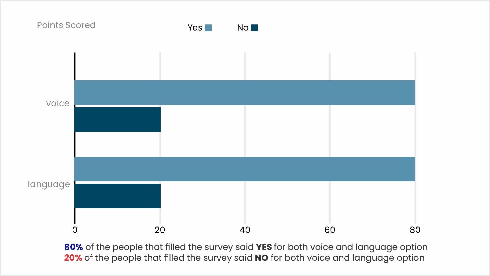
Voice and language function (NO response): After seeing the statistical results, we conducted additional interviews to ascertain the reasons why users would not desire the voice and language feature. Their comments indicated that they didn't think they could rely on it to remind them consistently. Some claim that the English language is a universal language for better communications and understanding therefore there is no need for multiple languages for the language function.
Voice and language function (YES response): After speaking with the 20% who don't want this feature, we interviewed the remaining 80% which included those with disabilities to find out why they would prefer it. They claimed the voice feature will be incredibly useful because it will continually send them a reminder regardless of how busy they are. For the language feature, they said having multiple languages will enhance better communications and not cause a barrier with tasks accomplishment
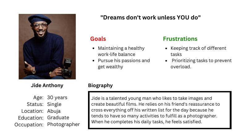
USER PERSONA
EMPATHY MAP
We used user research to foster empathy. This approach was used in both qualitative and quantitative research. We developed a survey questionnaire that received 13 responses. 69.2% of all survey participants use a TO-DO app; the majority of their pain points were focused on the lack of voice reminders in most TO-DO apps and the language barrier, as most users want an app with multiple language options.
PAIN POINTS
- Inability to carry out tasks effectively
- Inconsistency to complete daily tasks
- Due to user’s busy schedule, they forget to check their written notes
- Finding it difficult to prioritize multiple daily task
- Dread of misplacing a written message
TOOLS USED
- Figma
- Figjam
- Google Doc
- Google Form
- Google Meet
- Whimsical
- Slack
- Telegram
USER FLOW
STYLE GUIDE
MID FIDELITY
HIGH FIDELITY
USABILITY STUDY
After developing our low fidelity, we decided to conduct a usability study to see if our user flow was simple, fair, and accessible. To this end, we held meetings with our product stakeholders and five participants.
PROJECT STAKEHOLDERS:
During this phase, we had a meeting with the Quality Assurance Manager and Product Manager through Google Meet on Thursday at 10 p.m. We received encouraging feedback from which confirmed that the user flow was simple and equitable
PARTICIPANTS:
We only had five participants: two men, two women, and a user of assistive technology. We were required to use both the moderated and unmoderated usability studies throughout this phase.
MODERATED USABILITY STUDY:
At this stage, Efa and Precious had to conduct interviews and act as the moderator to assist our participants with the user flow should they encounter any difficulties. They also provided them with a non-disclosure agreement to fill out and sign in order to protect their privacy and to prevent the design of the product from leaking out, and they provided Incentives for their time after the task.
UNMODERATED USABILITY STUDY:
Christian and Dorcas had to email each participant at this stage with a non-disclosure agreement form to protect their privacy and also not to leak the product design. They also attached the low fidelity link. The purpose of this phase was to see if users could use the user flow without assistance from a moderator. Here is an example of a task they were asked to complete after this step, and the feedback we received indicated that it was positive.
Prototype Link